Insight
June 11, 2025
How one small language change is transforming platform adoption in small business insurance.
Small businesses take big risks but lack the tools, insights, and support that large companies rely on to manage it. Riscrow was built to close that gap. A fast, highly visualized, transparent risk management platform that empowers business owners before, during and beyond insurance.
Our mission: make sophisticated risk profiling and guidance accessible to small businesses, unlock smarter coverage and alternative risk transfer opportunities, and deliver more comprehensive protection through human-led services that were once reserved for enterprises.
Tools That Fit the Way Small Businesses Work
Small business owners don’t have time to maintain a risk register. Starting a risk plan from scratch was never the answer. Especially not one labeled with intimidating terms like "register" or "enterprise risk." Even "Risk Management" carries a weight that feels too corporate, too disconnected from the daily hustle of running a business.
At Riscrow, we knew our language had to work as hard as our platform because for small business owners, how something is named often defines how they interact with it, or whether they do at all.
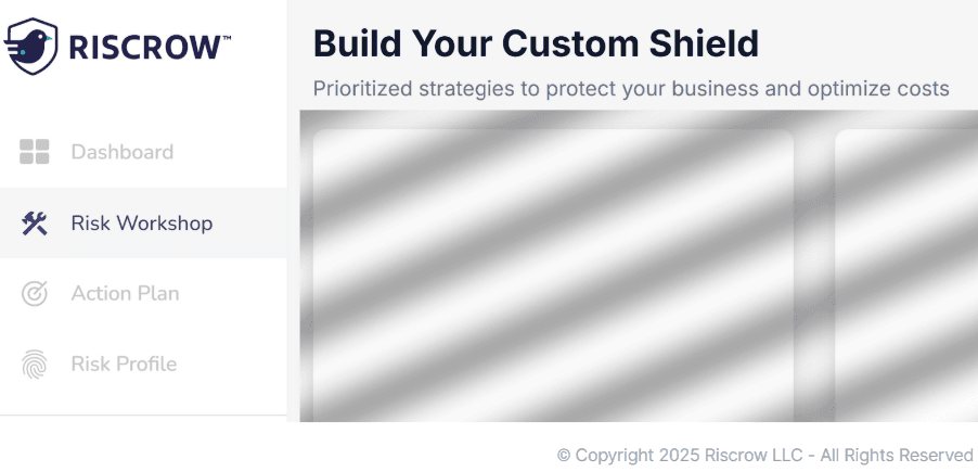
From Risk Management to Risk Workshop
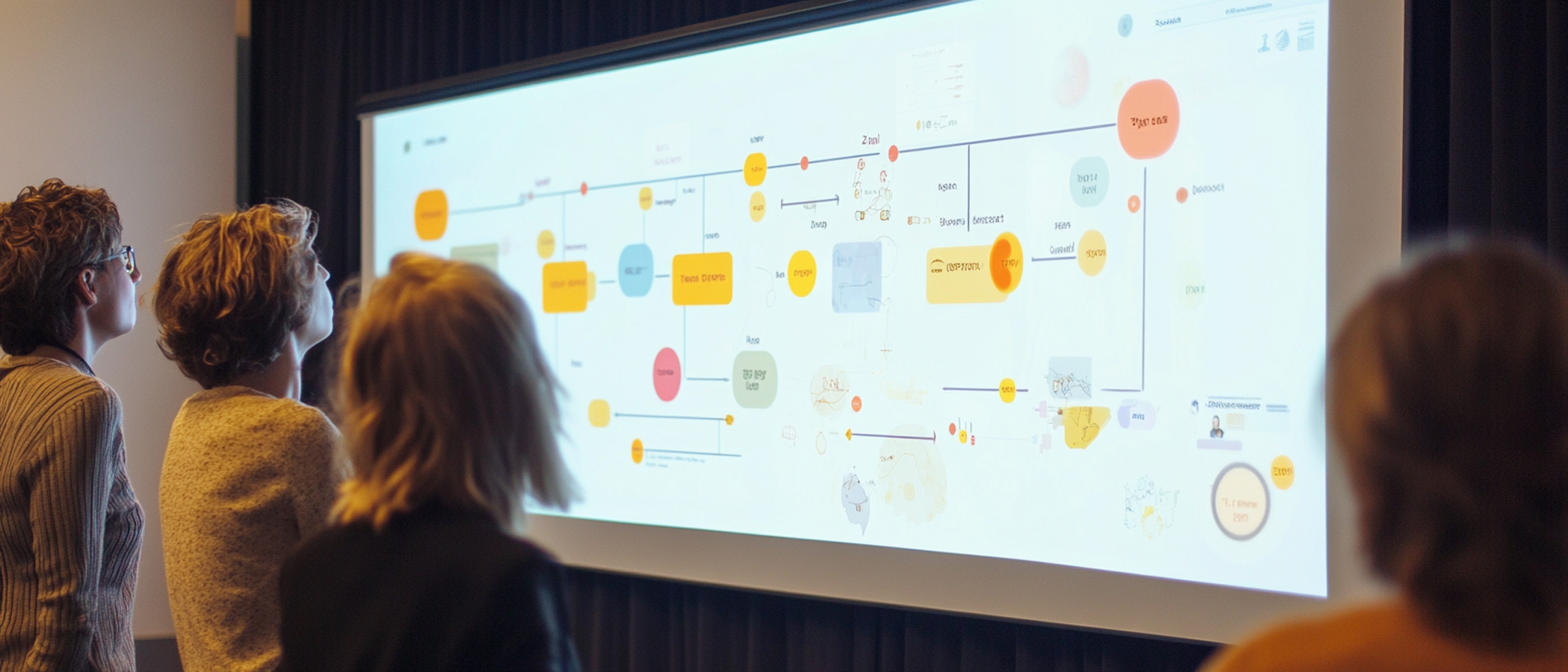
Instead of asking business owners to track and manage risk in static forms, we created the Risk Workshop. A dynamic, pre-filled risk visualization feature that updates automatically with new insights and coverage information, and guides the user through key insights. It doesn’t feel like homework. It’s a quick, intelligent exercise that configures what we call the business’s “Custom Shield.”
Beyond the use of visualization, changing the language changed the experience. "Workshop" feels active, brief, and valuable. It implies progress without pressure. "Custom Shield" delivers a tangible outcome. Something the user can see, adjust, and feel good about.
Words as UX: Naming as a Strategic Lever
Every label in Riscrow is deliberate because what something is called shapes what it becomes. By designing words that feel intuitive, empowering, and familiar, we give users the confidence to engage and the clarity to act.
We simplified the feature through distinctive visualization and we simplified the way in through words.
The psychology behind this is rooted in semantic reframing.
When we replace intimidating or overused terms with ones that sound fresh, modern, or even a little playful, we lower the barrier to entry. This ties closely to the “euphemism treadmill,” where language must be continuously refreshed as old terms accumulate baggage. In Riscrow’s case, the product feature did evolve but even if it hadn’t, the naming alone reshaped the user experience. Good language design is good UX.